If you're anything like me, you may have spent most of your adult life thinking that monochromatic is the same as grayscale.
After a firm telling-off by an artist, I was set straight on the matter.
What I had always considered monochromatic is, in fact, achromatic - the absence of any colours. Achromatic is the word we should be using when discussing grayscale.
Now that we've established what it's not, let's demonstrate what it is.

What is a Monochromatic Colour Scheme?
We will unlikely escape grayscale and monochrome synonymy in our day-to-day lives. But if you're reading this article, there's still hope.
It's crucial for us to always specify a hue when we use the word monochrome. If not, we're only telling others that our room is a single colour, not a specific colour.
For example, is it a blue monochromatic? A yellow monochromatic? And so on.
Below are two significantly different colour palettes; both are monochromatic, illustrating how broad the term is.


Six Tips for Monochromatic Décor
Now that my rant about achromatic vs monochromatic has drawn to an end, let's jump to the most important subject:
How can we use monochromatic colour schemes in interior design?
I will cover six tips on using monochrome, and then we'll look at different colours and room combinations to inspire us.
1. Base Colour
Our first tip for designing with monochrome is to choose your base colour.
This step seems easy, but you should invest significant time into it.
Consider all the shades, tints, and surfaces you need to cover. How will faucets, crockery, house plants, and window treatments fit the scheme?
Compare the green palette from earlier and how much it differs from the lime green palette below.

If you want lime green walls, you'll probably want to use light wooden floors, leaving you with olive greens as accents. Or if you choose olive green walls, you could use dark wooden floors, wooden blinds, and lime green accents.
It's crucial to consider which colour is your base making up 60% of your room, the 30% that you'll add for floors, ceilings, or furnishings, and the 10% for accents.
2. Texture
Our second tip is to utilise texture to add depth to your design.
What monochromatic doesn't mean is that every surface should look the same. It's a limited colour palette, but it doesn't need to be boring.
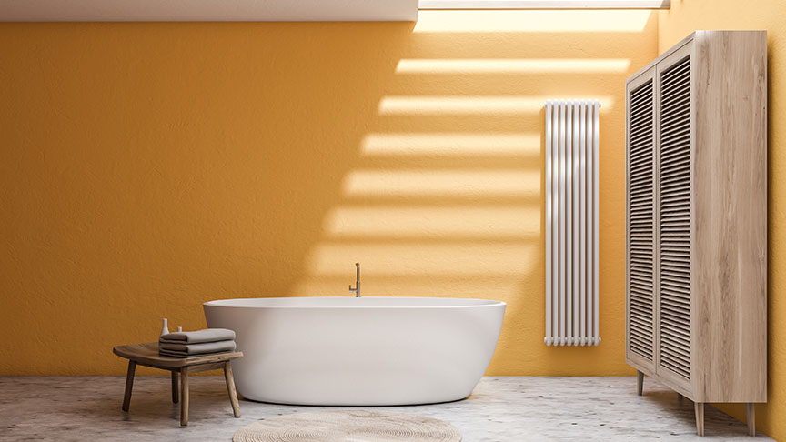
Have a look at this image and notice the use of texture. The colour palette hasn't changed, but the designer added complexity.
Notice the textured walls; they are coarse, adding character to the wall. A marble floor also adds interest, not drawing attention away from the focal point of the bath.
Shabby Chic utilises this effortlessly through chalk paint or sanding down for a distressed look.
3. Small Details
Our third tip is to pay attention to the small details in your room.
The saying that the 'devil is in the detail' conveys that it's often the smallest of details that trip us up. It's wise to plan for them as part of your new monochromatic design.
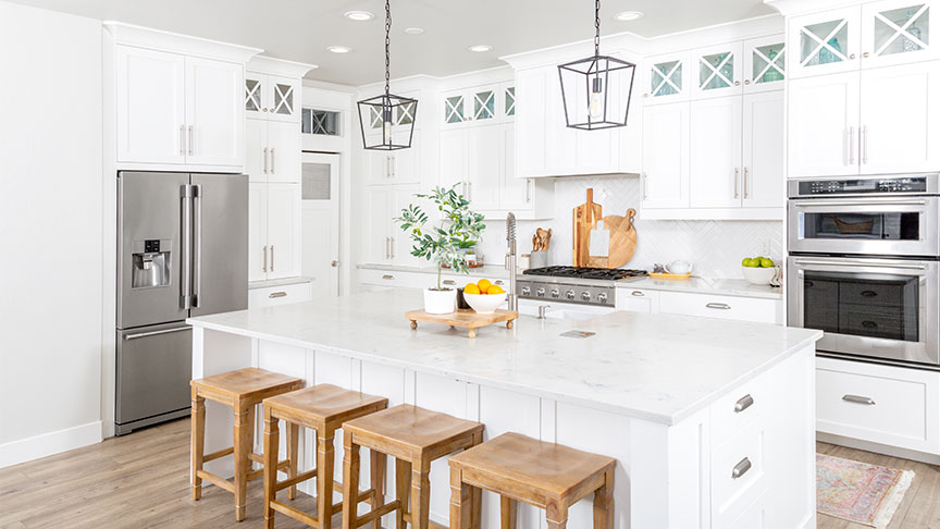
Take, for example, a kitchen and to exaggerate the point, I'm going to use an achromatic colour palette of white. Notice below those small decorations with colour pop-out?
The same happens with monochromatic palettes; small details can stick out like a sore thumb or add enormous depths to your design.
Some of the most commonly forgotten details are light switches, wall sockets, door handles, faucets, and pottery. Remembering these small details will take an ordinary design to the extraordinary.
4. Cheat with Neutrals
Our fourth tip is to feel free to utilise neutral colours generously; don't limit yourself.
There's nothing wrong with utilising black, grey, white, or even colours such as cream, beige, tan, or brown. It may feel like cheating, and maybe it is - but it looks great.
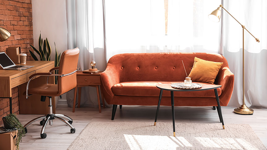
In our example below, the designer pairs an orange sofa with a brick wall; both stand out thanks to the generous use of light wood flooring, a cream rug, and white curtains.
5. Subtle Rule Breaking
Our fifth tip is similar to the above, but we recommend using other hues discreetly.
If you look at our colour wheel below, some colours sit in-between primary colours. These are the secondary and tertiary colours.
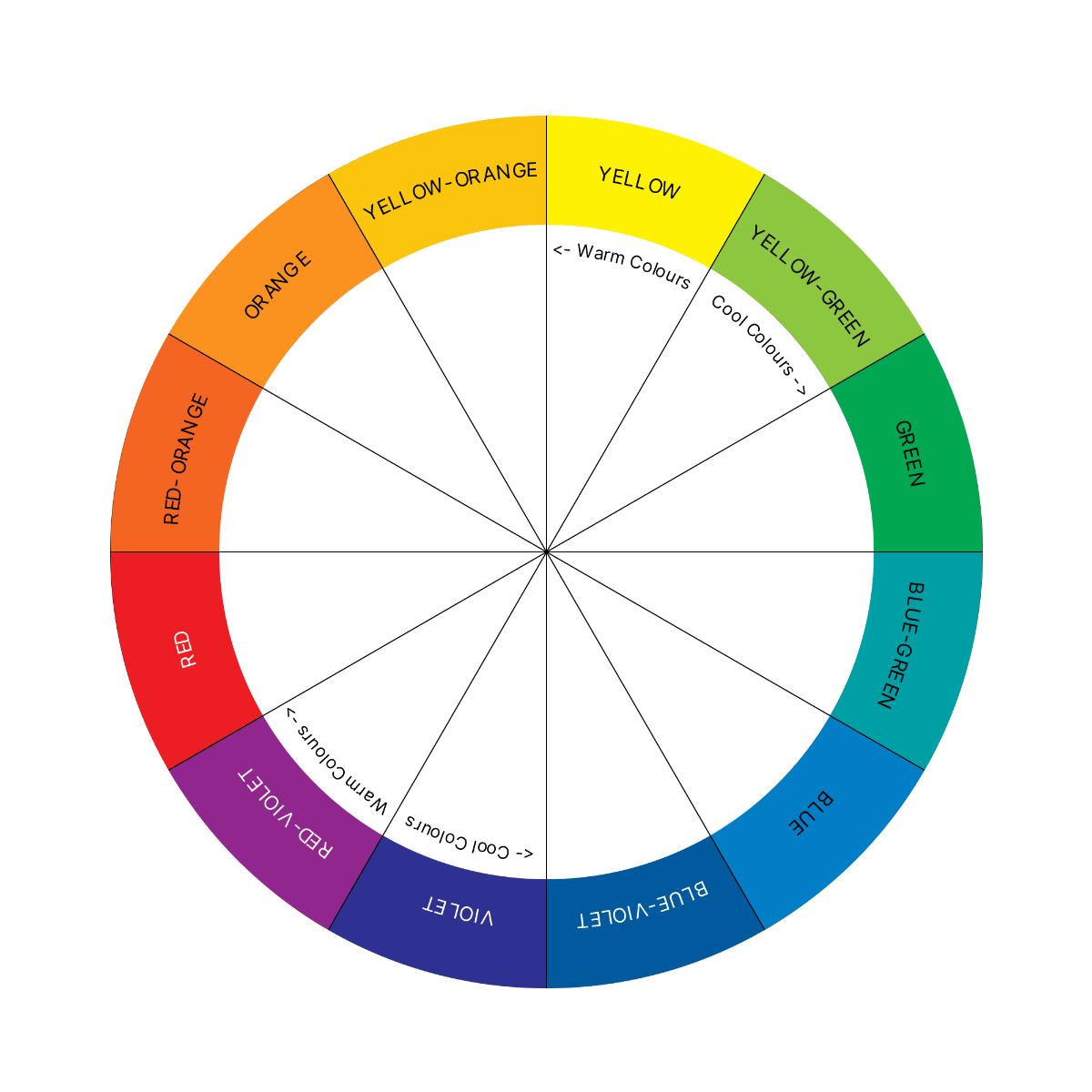
You can use these colours in two ways, both of them subtle.
The first way is to use secondary and tertiary tints. A tint is when the colour includes large amounts of grey. This tip discreetly adds extra colours to the room.
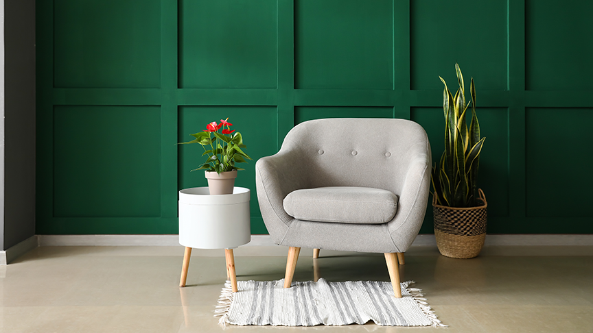
Alternatively, a second way is to use tiny amounts of other colours through decorations. Anthuriums are mostly green plants with red flowers. As a decoration, it blends neatly into a green colour scheme and adds a pop of red.
6. Bold Rule Breaking
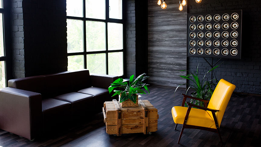
Our sixth and final tip is that sometimes you should add contrast by breaking the rules in a big way.
Here's a dark, achromatic living room to push this point to its furthest extreme:
While most of the room offers little contrast, the yellow armchair adds excitement and focus. It's hard for your eyes not to be drawn towards it.
That armchair is an excellent example of bold rule-breaking.
Examples of Monochromatic Rooms
Now that we've shared some great tips on using monochromatic colour schemes, we're going to share a selection of exciting rooms. We'll add a few of our thoughts with each image.
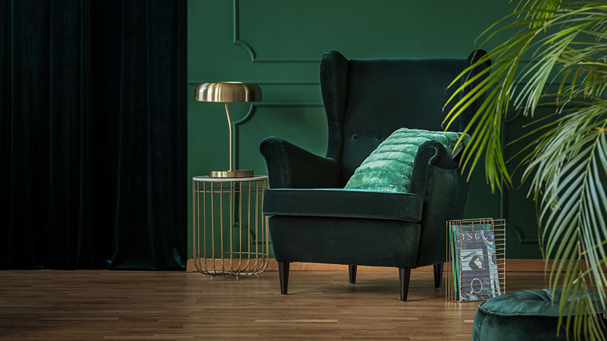
Green Living Room
Green is one of the most popular colour palettes for monochromatic design. Our human eyes can process more shades of green than any other colour - which is why green works so well.
Dark green furnishings contrast against a pine green wall, accented by a teal green cushion. Decorations include green books and a palm plant, just outside of focus.
Using wooden flooring and golden hardware creates a modern yet regal decor with a heavy sense of nature.
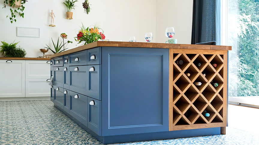
Blue Kitchen
Blue is a stylish colour for monochromatic colour designs, able to draw on lots of exciting shades and beautiful blue-green colours.
In this example, the designer chose blue cabinets on the island as the centrepiece for the kitchen. Blue Mediterranean-themed tiles on the floor add charm to the room.
The designer completes the look with blue-grey tinted curtains hung along full-height windows.
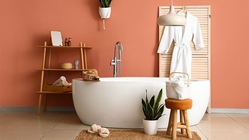
Terracotta Bathroom
Terracotta is a beautiful burnt orange colour that adds warmth to any space, paired excellently in this design with a white bath and decorations.
Notice how the small use of green plants offers cool contrast against the warm orange hues. These plants are an excellent example of subtly breaking away from colour schemes.
Large reflective floor tiles are sandy-coloured, while light wood, rope, and a jute bath mat add to a coastal theme.
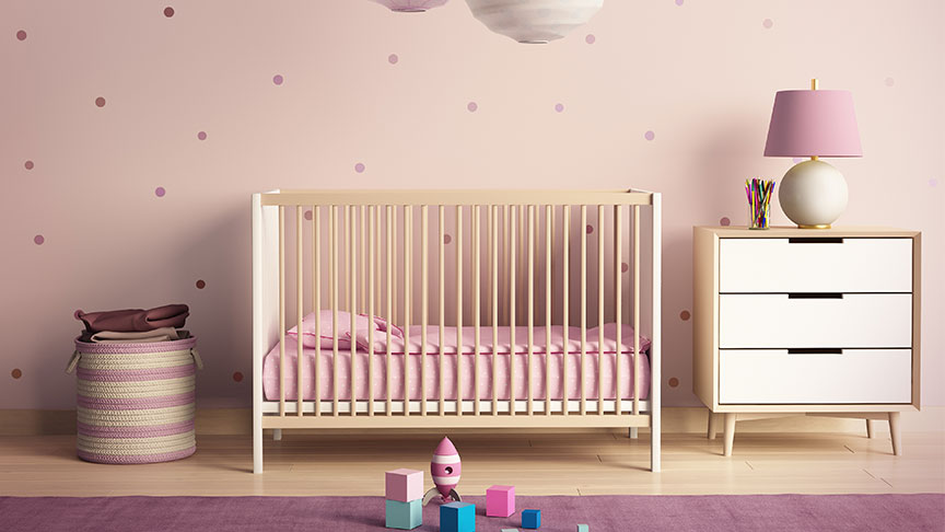
Purple Nursery
A fun use of pinks and purples, this nursery utilises lighter colours, such as lilac and lavender, to avoid a dark or moody room.
The use of cream with these lighter purples offers an excellent complement, matching the light wood furniture.