Blog
-
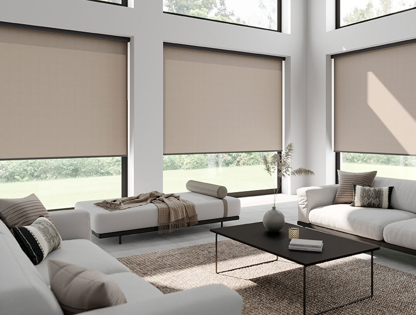
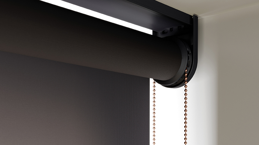
When it comes to creating a cosy and energy-efficient home, the question of whether roller blinds keep the heat in is a common one. The answer yes, but by how much? Read on to find out.Read More
-
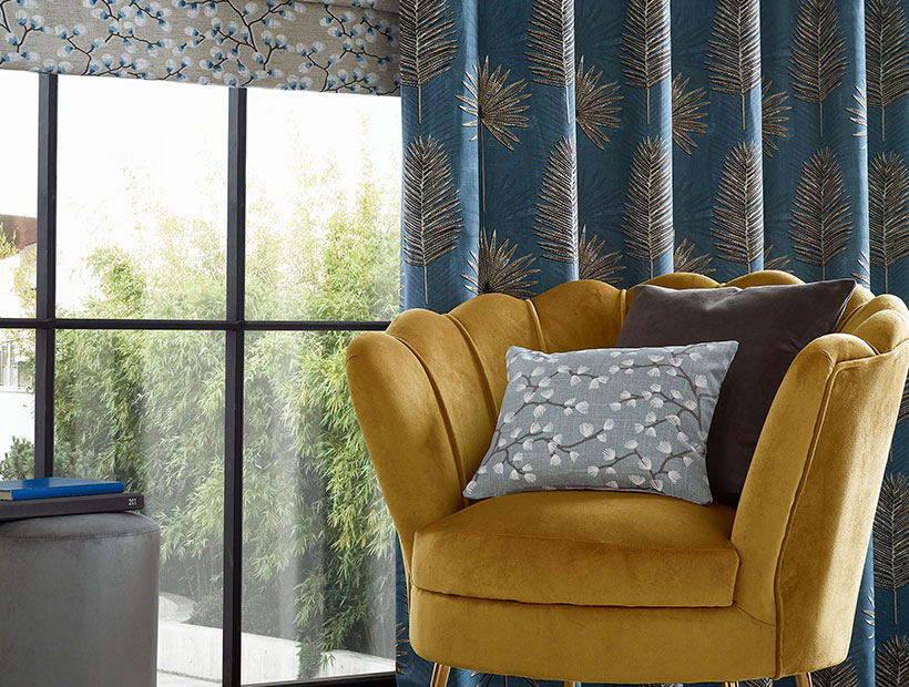
The Complete Guide to Different Types of Curtains
If your living room is feeling a bit lacklustre, your bedroom is begging for a makeover, or you simply want to add some flair Read More
Marvellous Modern Blind Ideas for Your Home
If, like us, you've watched a few too many episodes of Grand Designs, you've likely found yourself with a crippling desire Read More
Sought after Spaces
Read MoreWe analysed social media data and surveyed 2000 member of the British public to reveal which rooms and home items Brits desire most.
TikTok Interior Trends
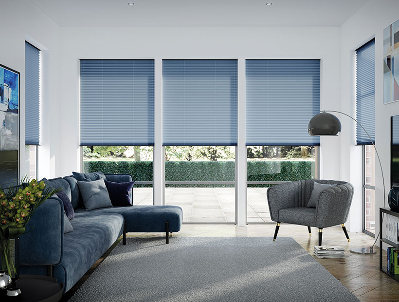
Which of this year’s biggest interior design trends are the most popular on TikTok? Our experts have analysed global viewing figures to bring you the answers.Read MoreUnfolding The Mystery: What Are Pleated Blinds?
Pleated blinds are made of lightweight fabric, stiffened with a thin layer of glue, and folded to create an accordion effect... Read More
Choosing Fabrics: Which is Best for Roller Blinds?
Whether you are looking to build your roller blinds... or buy a fresh pair, it's essential to Read More
Pencil Pleat Curtains: The Beginner’s Guide
Maybe it's time to move house, or perhaps you moved house and can't stand the curtains... from the Read More
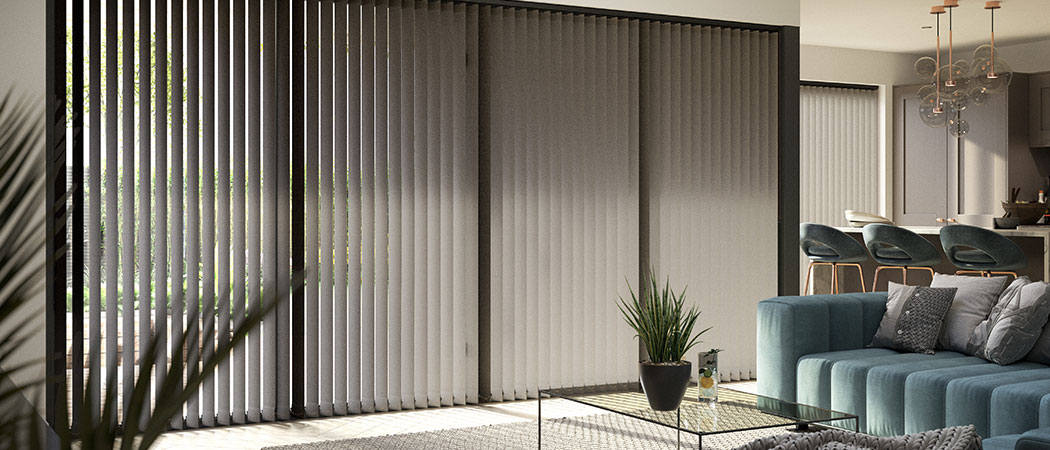
What are Vertical Blinds? Our Experts Answer Your Questions!
Vertical blinds... are a type of window treatment characterised by long vertical slats opening and closing to the sides. Read More
Should All Blinds And Curtains Match? Here's What We Think.
Customers often ask us whether all blinds or curtains... in a house should match. Read More
Farmhouse Blinds: 9 Tips for a Sophisticated, Rustic Look
Farmhouse design has exploded in popularity over the past few years. It blends practicality and comfort with neutral hues... Read More
Which Way Round Do Roller Blinds Go?
The world is still settling the time-old question of which direction to fit toilet paper, but has the public decided on... Read More

